

With an anticipated 35% growth rate through 2032, the US Bureau of Labor Statistics projects data science as one of the three fastest-growing American job fields.
Whether you’re a data scientist now, focused on collecting, shaping, and maintaining data, or a data analyst using that data for exploration, insights, and answering questions, quality tools are essential. The same applies to organizations that support or rely on these professionals.
This article looks at data science resources for users with different levels of experience and those working at different scales. It also includes tools for people who are just starting out or hoping to enter the field. If this latter includes you, check out this PTP article for more advice on getting started overall.
Below, we consider different types of tools. These range from large-scale business intelligence platforms, including many software-as-a-service options, to free and open-source tools.
8 Tools for Analysts and Data Scientists to Consider
- Tableau
- Power BI
- D3.js
- Python
- R
- Julia
- Apache Spark
- Excel
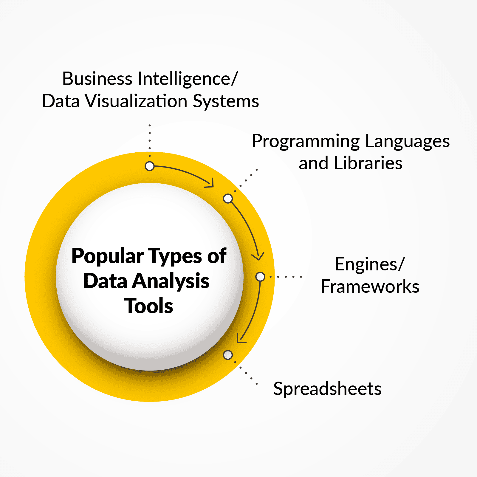
Business Intelligence Tools/Data Visualization Tools:
1. Tableau
Originally founded in 2003 by developers at Stanford, Tableau was acquired by Salesforce for $15.7 billion in 2019. This made it part of the Salesforce ecosystem.
Tableau is an industry leader in data visualization. It is known for its wide range of visual options, including charts, graphs, maps, and custom visuals.
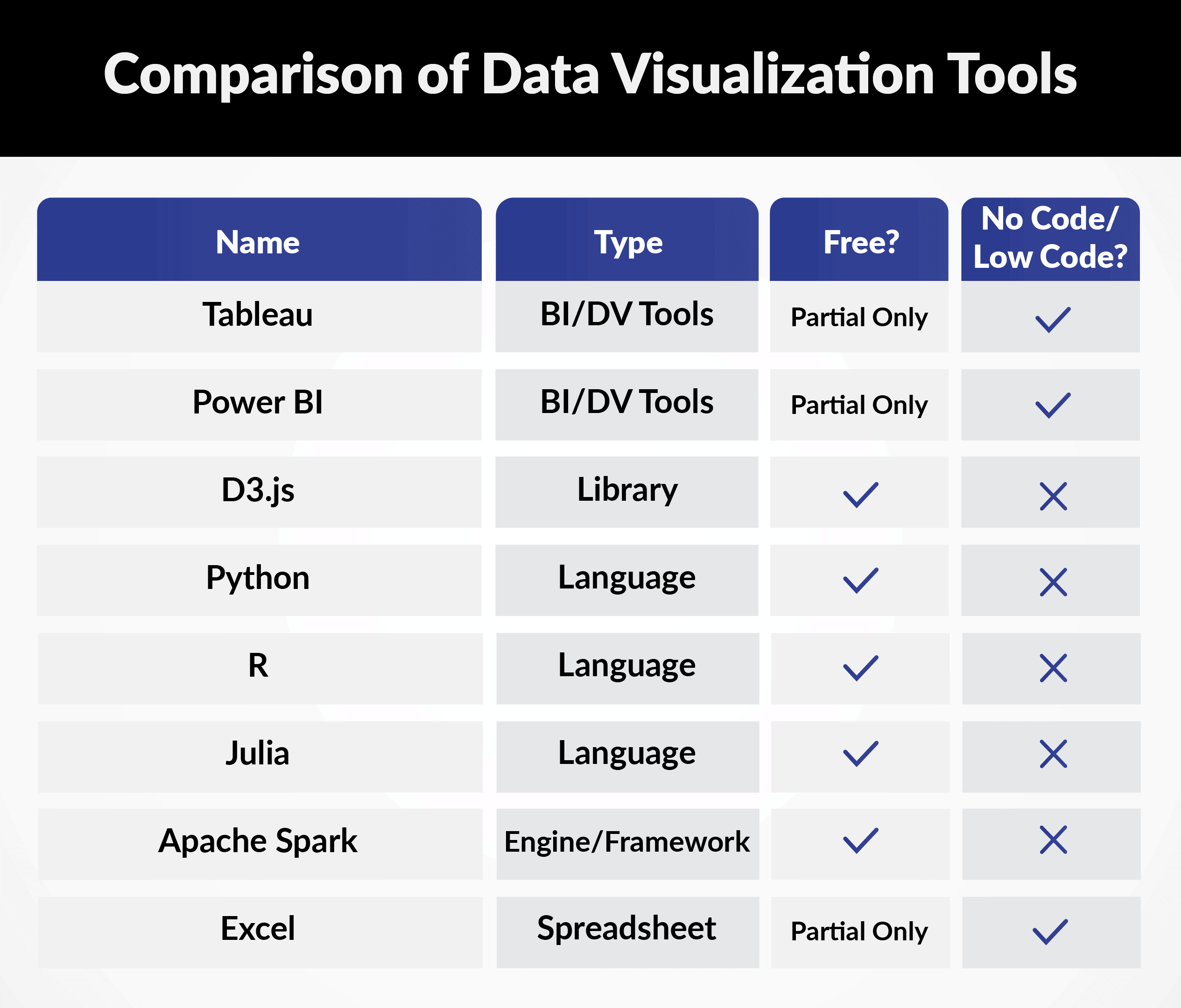
Tableau Public offers a free platform, but it limits data connections and user control. Many of Tableau’s key features are available only through the paid service. The details below cover the paid version of Tableau.
Features:
- Business intelligence tools
- Data visualization tools
- Dashboard tools
- Data storytelling tools
- Infographic software
- Data analysis software
- Visual analytics software
- Desktop application and/or web-based
- Cloud options with the ability to self-host and serve
- Extensive security options
- Integration with Slack
- A wide range of data connections, including enterprise databases, cloud services, CSV files, and Salesforce
- Strong exploration and data storytelling features
- Highly interactive visualizations using many visualization methods
- A drag-and-drop interface, although more skills may be needed for advanced interactivity and integration
- A larger learning curve than some competing platforms
- One of the industry’s widest selections of maps, charts, graphs, and custom graphic options
2. Power BI
Dating back to 2011, Power BI is Microsoft’s complete business intelligence platform. It integrates well with Microsoft products and competes directly with Tableau.
Power BI offers a wide range of data science and analysis functions. These include Copilot, which supports generative AI integration.
As with Tableau, the details below focus on the paid version of Power BI, which is available in several tiers.
Features:
- Business intelligence tools
- Data visualization tools
- Dashboard tools
- Data storytelling tools
- Infographic software
- Data analysis software
- Analytics platforms
- Strong integration for businesses already using Microsoft tools
- A familiar learning experience for many Excel users
- No Mac version and no official Linux support
- Cloud and on-premises hosting options
- A wide range of data connection options that can be combined
- Drag-and-drop interface options
- Advanced analytics, including natural language queries and machine learning
- High resource usage, especially when handling very large datasets
Languages and Libraries:
3. D3.js
Short for “data-driven documents,” D3 also dates from 2011. It is a free, open-source JavaScript library used to create interactive data visualizations for web browsers.
Features:
- Data visualization tools
- Coding library
- Free and open-source
- Uses HTML5, SVG, CSS, and JavaScript
- Familiar and easier to adopt for users with web development experience
- Built for creating browser-based data visualizations
- Fast performance, even with large datasets, although SVG rendering may create limits
- Greater control and interactive features
- May be too advanced for small-scale projects
- Can be combined with higher-level tools such as Observable Plot
4. Python
Python is a general-purpose programming language with more than 30 years of history. It remains popular among experienced developers and beginners because of its simplicity and flexibility.
Its wide range of libraries makes it a useful tool for both analysts and data scientists.
Features:
- General programming language
- Graphing software
- Charting tools
- Data visualization tools
- Free and open-source
- Large and active user community
- Easy to learn with readable syntax
- Rich library network, including:
- Matplotlib for plotting, inspired by MATLAB for Python
- Seaborn, a visualization library based on Matplotlib
- Bokeh for creating browser-based visualizations
- NumPy for matrices and multidimensional arrays
- Pandas for data manipulation and analysis
- SciPy for scientific computing
- TensorFlow for machine learning
- More flexible than many specialized languages
- Can be slower or less efficient at runtime than lower-level languages
5. R
R is another programming language and a powerful statistical tool with 30 years of history. Educators at the University of Auckland created it to teach introductory statistics.
It remains popular among statisticians for analysis, data mining, and the creation of statistics-based software.
Features:
- Statistical computing programming language
- Graphing software
- Charting tools
- Data visualization tools
- Free and open-source
- Designed for data analysis
- Especially popular in finance and academia
- Offers many well-known packages, including:
- ggplot2 and ggraph for visualizations
- dplyr for data wrangling and analysis
- tidyr for data cleaning
- leaflet for maps
- knitr for PDF reports
- shiny and plotly for interactivity and web applications
- Can import data from many sources
- Has a larger learning curve than business intelligence tools
- Strong graphing and visualization capabilities
- Compatible with many other tools because of its popularity
- More difficult to learn and less flexible than Python
- More directly focused on statistics
6. Julia
Julia is a newer, high-level programming language. It was created to provide an open-source license and better performance than some other high-level languages.
Features:
- Scientific computing language
- Free and open-source
- Designed to offer better performance than Python
- General-purpose and suitable for machine learning and numerical analysis
- Used by organizations such as Intel, Disney, Google, IBM, and NASA
- Has fewer libraries and packages because it is newer
- Has a smaller community and fewer online learning resources
Other Types:
7. Apache Spark
Originating at UC Berkley, Apache Spark is an open-source analytics engine designed for big data processing. It is a computational framework that can process large volumes of data using widely used programming languages.
Features:
- Big Data engine
- Free and open-source
- Parallel processing
- Designed for distributed data processing
- Uses in-memory processing for fast access and analysis
- Often faster than Hadoop
- Works with Python, R, Java, Scala, Julia, and SQL
- Helps developers build applications more quickly
- Used across finance, healthcare, marketing, and other industries
- Versatile and general-purpose
- Built for fault tolerance
- Can continue operating when some parts fail
- Uses clustering for batch processing and real-time streaming
8. Excel
The oldest tool on this list, Microsoft Excel has long been a major part of data work. It remains useful for organizing, analyzing, and visualizing information.
Features:
- Spreadsheet editor
- Analyst tools
- Reporting tools
- Widely used for nearly 40 years
- An important tool for analysts to understand
- Fully integrates with Microsoft Power BI
- Accessible and easy to use
- Continues to receive new features and support
- As of September 2023, Microsoft began adding the py function, allowing Excel to use Python directly within the grid without added software
- Includes Copilot for AI support
- Supports natural language queries and easier visualization
Conclusion
With its growing importance across all fields, data may be best treated as a business product, as considered in this PTP article. Tools like those covered above can help organizations do exactly that.
Whether they are used for data presentation, exploration, or insight, these tools provide many valuable options for analysts and data scientists interested in data visualization.